
The price of a loaf of bread or a bag of rice looks simple at the checkout. Behind it sits a much longer chain: natural gas turned into ammonia, phosphate and potash mined in a handful of countries, fertiliser shipped through narrow sea lanes, and weather deciding what finally grows in the field.
The global agrifood system is not one market. It is a chain of linked systems: gas, fertiliser, shipping, finance, climate, and policy. For years, policy and market mechanisms helped absorb shocks across that chain. But the buffer is thinner than it looks. By mapping the convergence of geopolitical volatility, erratic climate cycles, and shifting input costs, this post uses the data to show where the system bends, where it breaks, and how the next shock, or the current one, may travel from gas markets, or the Pacific, to food prices.
Scene 1: Fuel, Fertiliser, and Food
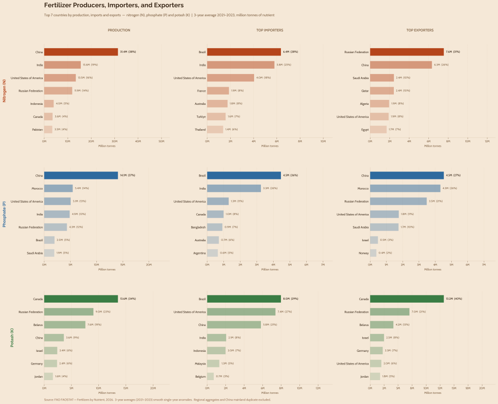
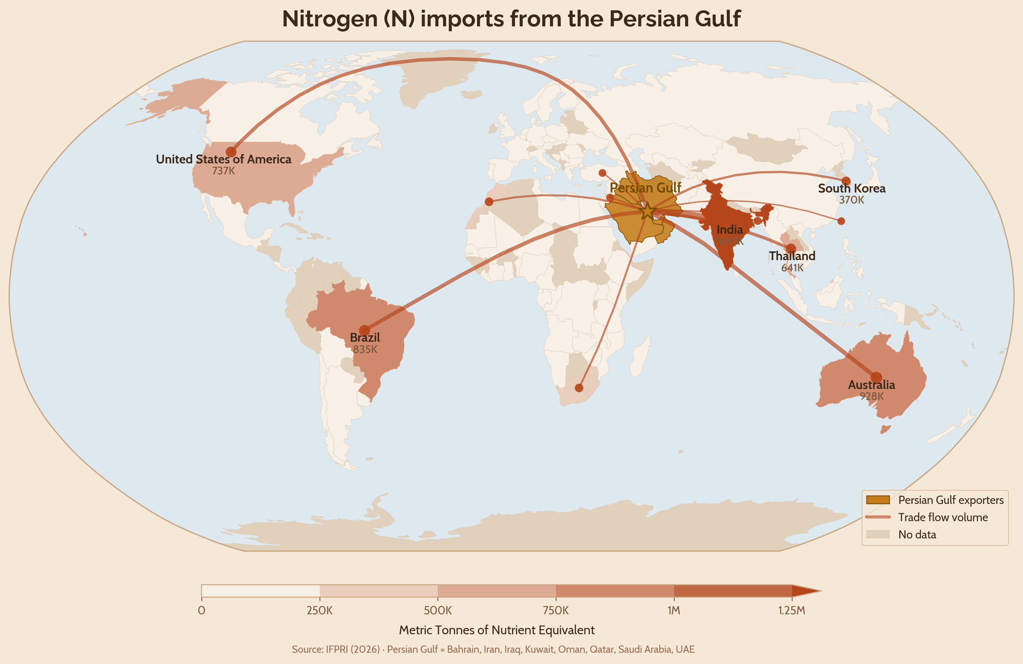
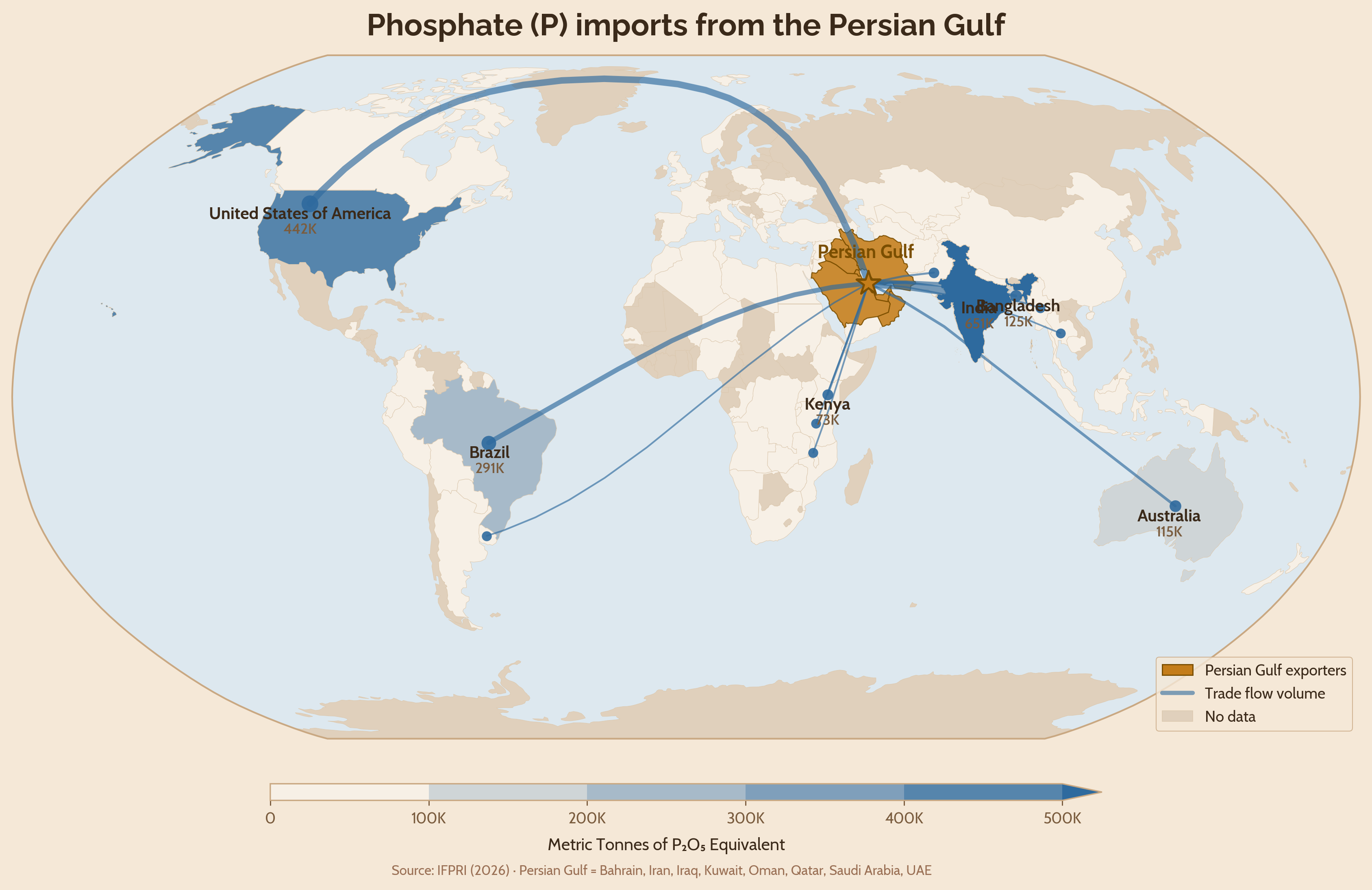
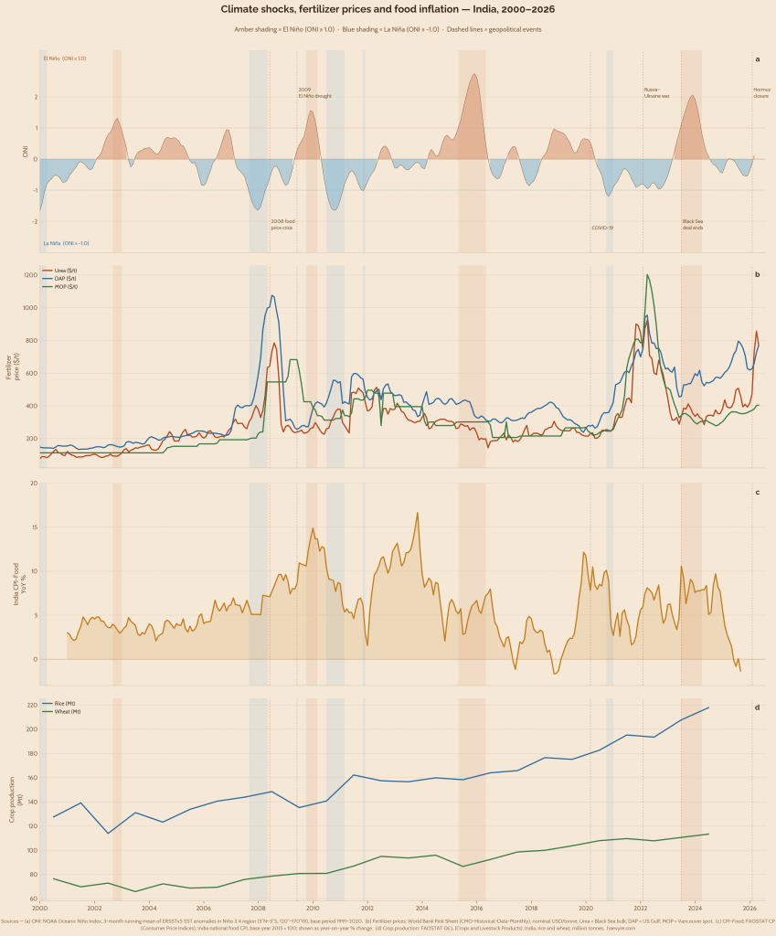
The global energy system is deeply intertwined with the agri-food system. The Haber-Bosch process, through which ammonia is synthesised, uses natural gas both as an energy source and as a raw material. The hydrogen feedstock is combined with atmospheric nitrogen to produce nitrogenous fertilisers used in virtually every agricultural system on Earth. That gas originates in one part of the world, such as the Persian Gulf, gets shipped to processing hubs elsewhere, China, Europe, or the Gulf states themselves, and the resulting fertiliser then travels onwards through complex logistical routes to farms across Asia, Africa, and Latin America, navigating geopolitics along the way. The same story holds for mineral-based fertilisers: phosphorus is mined primarily in Morocco and China, potash in Russia, Belarus, and Canada, and both are processed and exported to large agricultural importers like India and Brazil. The result is a global agri-food system that is structurally dependent on a small number of concentrated, politically sensitive supply corridors (Figure 1).
These corridors have already ruptured twice this decade. The first rupture came with the Russia-Ukraine war in 2022, which severed key potash and phosphate export routes and triggered a cascade of sanctions that repriced the entire fertiliser chain almost overnight. The second came with the closure of the Strait of Hormuz in early 2026, which cut off the Gulf’s nitrogen and natural gas flows – a different shock, hitting a different commodity and a different set of import-dependent countries but travelling through the same underlying chain (Figure 2).
Scene 2: When the Machine Breaks: Two Shocks Compared
The run-up to the Russia-Ukraine war saw European natural gas prices surge through 2021 due to low inventories and post-pandemic demand, causing several fertiliser plants across Europe to temporarily halt or reduce ammonia production from September to November 2021. When Russia invaded Ukraine on 24 February 2022, an already stressed market snapped. Russia accounted for 16% of global urea trade and 12% of phosphate trade, while Russia and Belarus together accounted for nearly 40% of global potash trade (IFPRI, 2024). Sanctions did not formally target fertilisers, but exports fell afoul of broader measures such as exclusion from the SWIFT payments system, insurers’ reluctance to cover shipments in a war zone, and the closure of EU overland export routes. At the peak, around 70% of European ammonia production capacity had been curtailed (World Bank, 2023). Thus, Muriate of Potash (MOP) rose 370%, Diammonium phosphate (DAP) 126%, and EU natural gas 863% from the January 2021 baseline, with urea following at 249% (Figure 3).
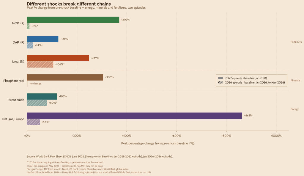
The closure of the Strait of Hormuz, following the outbreak of the West Asian conflict on 28 February 2026, put roughly one-third of global seaborne fertiliser trade at risk, with production across the broader Persian Gulf region suddenly having no clear ocean exit. Persian Gulf countries account for over a third of global urea exports and more than a quarter of global ammonia exports (IFPRI, 2026). Unlike the 2022 disruption, fertiliser produced in the Gulf cannot easily be rerouted when the Strait is closed. Thus, while MOP and DAP experienced only modest gains, urea climbed above $850 per metric tonne in April 2026, up 106% since January 2026 and the highest level since 2022.
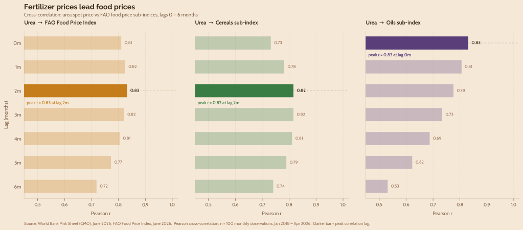
What connects both shocks to food prices is a transmission mechanism visible in the data: urea prices lead cereal prices by roughly two to three months (r = 0.816), and edible oils almost simultaneously at lag zero (r = 0.831) (Figure 4). Edible oil prices may often react more quickly to fertiliser and supply shocks than cereal prices because vegetable oil markets are highly integrated with actively traded futures markets, allowing expectations about future supply conditions to be incorporated into prices rapidly (Sarma et al., 2025). By April 2026, the FAO Oils sub-index had already reached nearly 194, 77% of its 2022 peak, before the nitrogen shock now works its way through to farms (Figure 5).
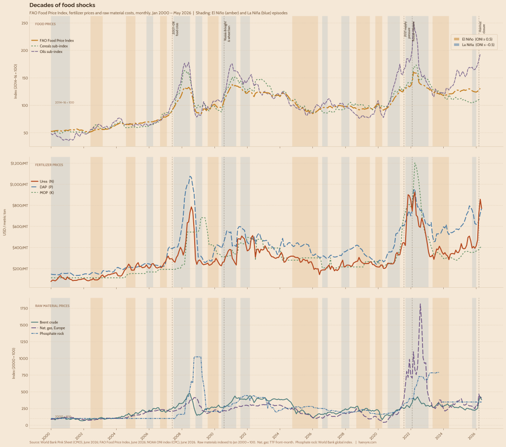
The trend is clear and recurring, and Figure 4 makes the sequence visible across two decades. Each major spike in the food price index is preceded by a fertiliser price spike, with raw material costs as the ignition. The 2007–08 food crisis is the first clear example: the FAO Food Price Index (FFPI) rose nearly 48% above its pre-crisis baseline, but DAP had already risen 144% and urea 80% in the same window, driven by an oil price surge that fed directly into energy-intensive ammonia and phosphate production costs. The 2010 Russian wheat export ban triggered the next wave – a 30% rise in food prices – but notably, potash barely moved. Then, in 2021, before a single sanction had been imposed, post-pandemic demand recovery, Chinese export restrictions, and an energy crunch pushed urea up 120% and MOP up 116% in just five months, pre-loading the system with fragility months before the Russia-Ukraine war began in February 2022.
Scene 3: From the Pacific to our Plates
Behind the geopolitical price spikes sits a second, slower-moving risk layer. Not originating in a war room or a shipping chokepoint, but in the temperature of the equatorial Pacific Ocean. The El Niño-Southern Oscillation, or ENSO, is a recurring climate pattern driven by anomalous warming and cooling of sea surface temperatures in the central and eastern Pacific. Those shifts reorganise atmospheric circulation and redistribute rainfall across the tropics and subtropics.
For countries like India, the channel is direct and well-known. El Niño years are often associated with weaker summer monsoon rainfall, and many of India’s major droughts have occurred during El Niño episodes. But the relationship between ENSO and global food or fertiliser prices is less direct. ENSO does not move prices like major geopolitical events do. Its price effects are delayed and uneven, and they are filtered through global macroeconomic conditions, inventories, futures markets, trade exposure, and commodity-specific market structure (Dufrénot et al., 2026; Gouel & Laborde, 2021; Sun et al., 2023; Tang & Xiong, 2012).
The Oceanic Niño Index (ONI), the standard index of ENSO intensity, shows its strongest correlations with major food and fertiliser price series at lags of four to twelve months. The correlations are negative across the series, with warmer El Niño conditions associated with lower global prices, while cooler La Niña conditions are associated with higher prices.
The ENSO signal moves differently from the geopolitical shocks described earlier. In the Ukraine and Hormuz episodes, the chain runs from fuel and fertiliser into food. With ENSO, food prices show the earlier association: FFPI is most strongly associated with ONI contemporaneously, while edible oils and cereals peak at three and five months. Fertiliser and raw-material prices peak later: DAP at six months, urea at seven months, and MOP and phosphate rock at twelve months. This suggests ENSO is not moving prices mainly through the same input-cost pathway as geopolitical shocks. It likely works through harvest expectations, regional crop conditions, input demand, and broader macro conditions. These are still aggregate correlations, not causal estimates.
Previous research reaches a similar conclusion. ENSO shocks affect commodity prices asymmetrically, with La Niña shocks generally producing stronger and more persistent responses than El Niño shocks, especially for agriculture and energy. This relationship looks noisy in aggregate, as individual commodities do not all respond in the same direction and are also influenced by several other aforementioned factors.
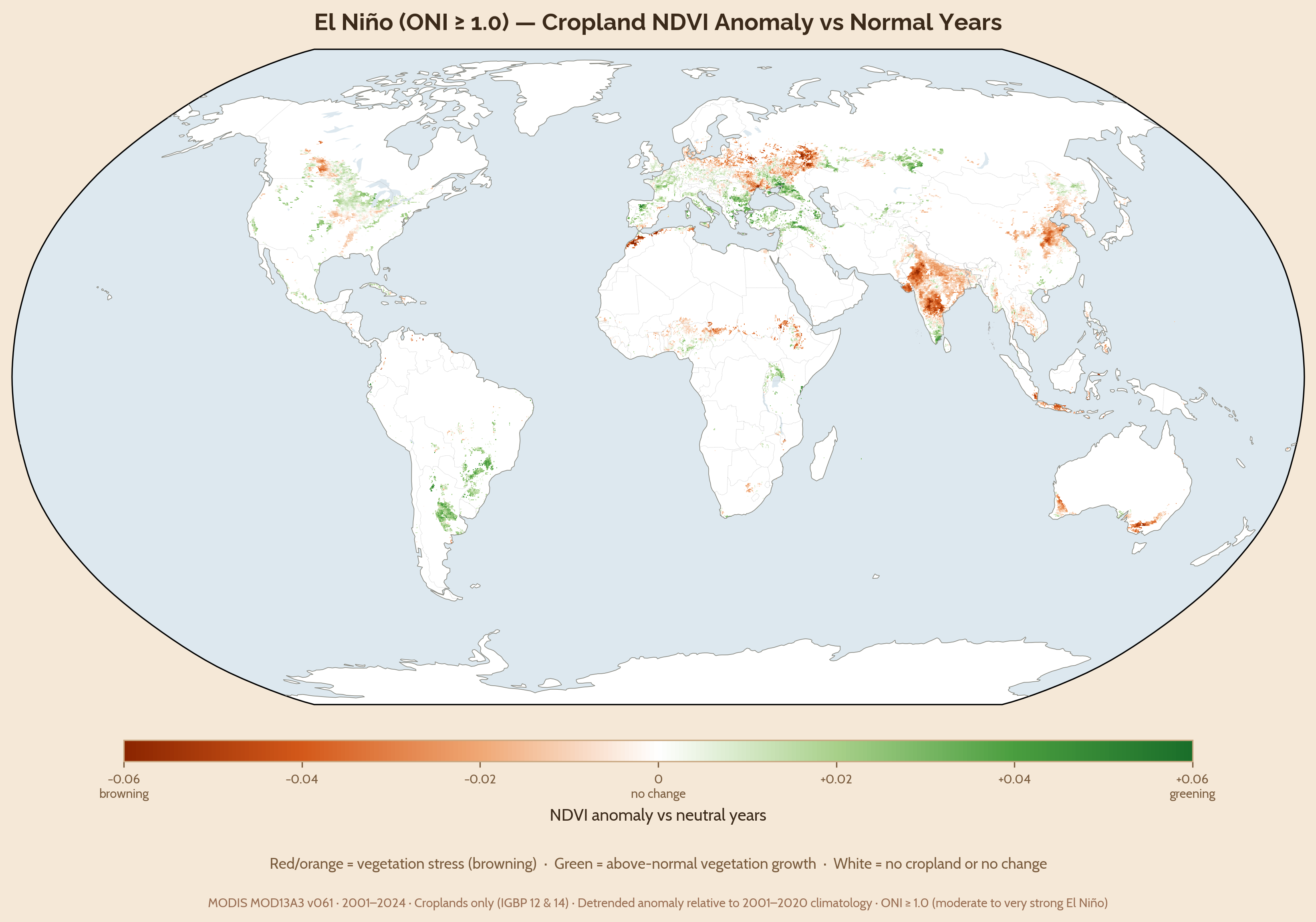
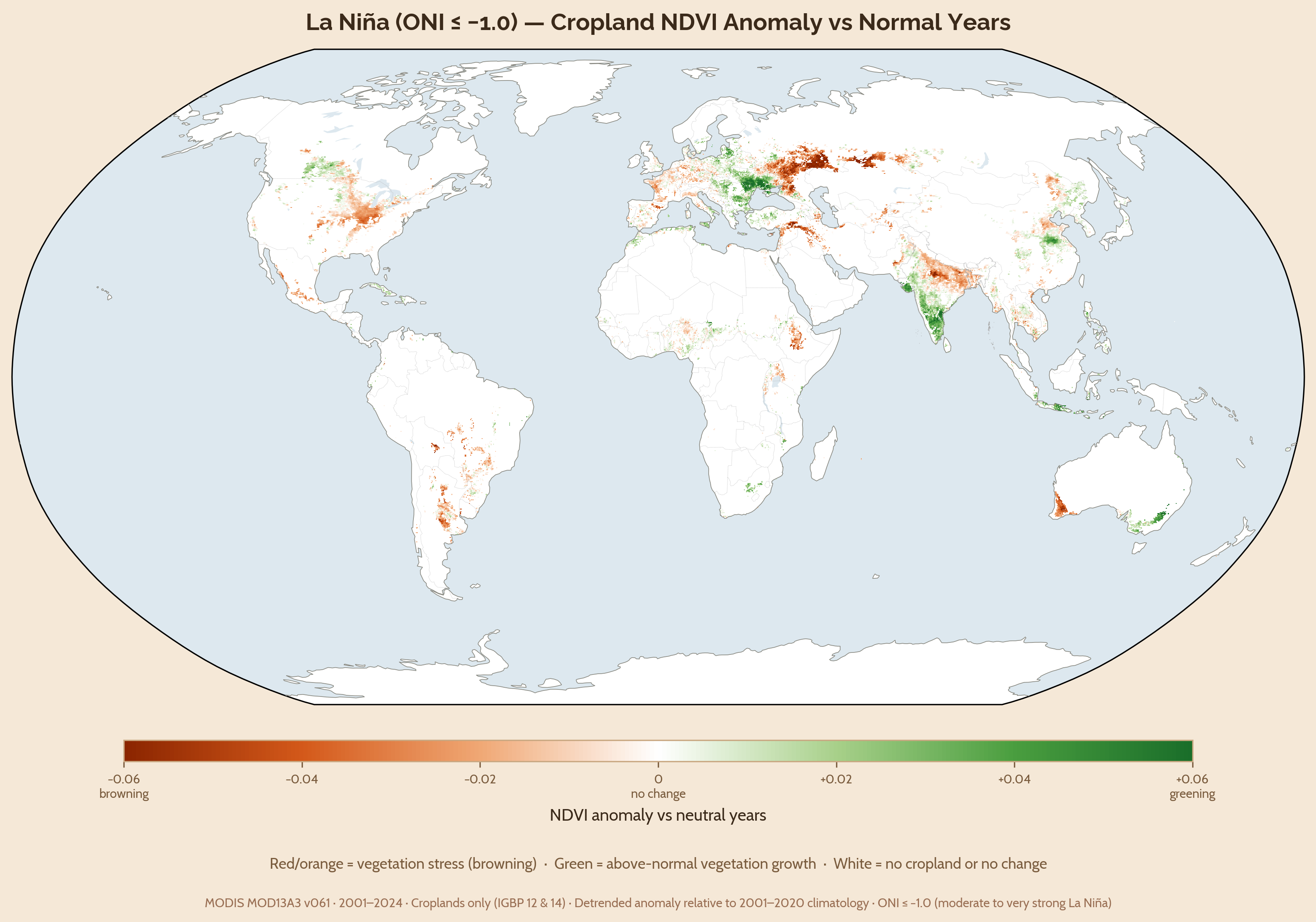
Figure 6 helps explain why. ENSO is global, but its biophysical footprint is patchy, wherein El Niño and La Niña do not simply make the world uniformly drier or wetter. They rearrange rainfall and, thus, growing conditions across regions. Some croplands become less green, others greener, and many show little change. This uneven geography is why the global price signal is difficult to interpret on its own. A global commodity index blends regions that may be experiencing very different climate conditions at the same time.
India’s Example
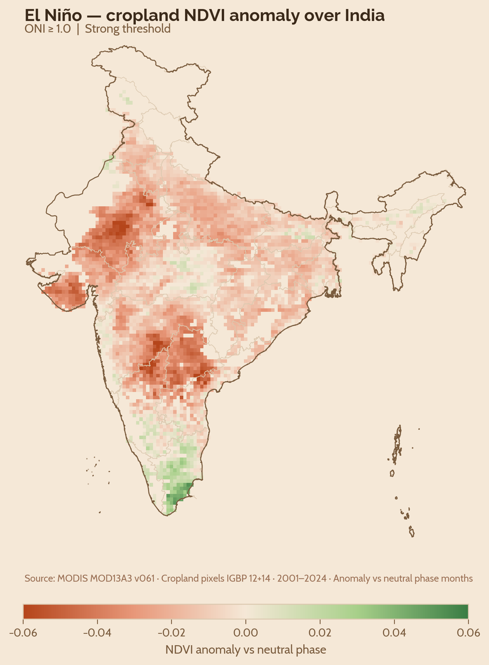
India shows this filtering rather clearly (Figure 7). At the national level, it is tempting to tell a simple story: El Niño weakens the monsoon, crops suffer, and food prices rise. The data used in this analysis supports parts of that story, but not all of it. In the peninsular rainfed states, El Niño years are less green than neutral years in both Kharif and Rabi, but the difference is not statistically significant in this state-level sample. That does not mean the El Niño effect is absent. It means the effect is being measured through large state boundaries that mix irrigated and rainfed cropland, different crop calendars, and different rainfall regimes.
The stronger signal in this analysis comes from La Niña. Peninsular India is markedly greener during La Niña than during neutral years, especially in kharif, and the El Niño-La Niña gap is large in both seasons. This suggests that the clearest vegetation response in these states is not a clean El Niño decrease in production, but a La Niña-triggered increase.
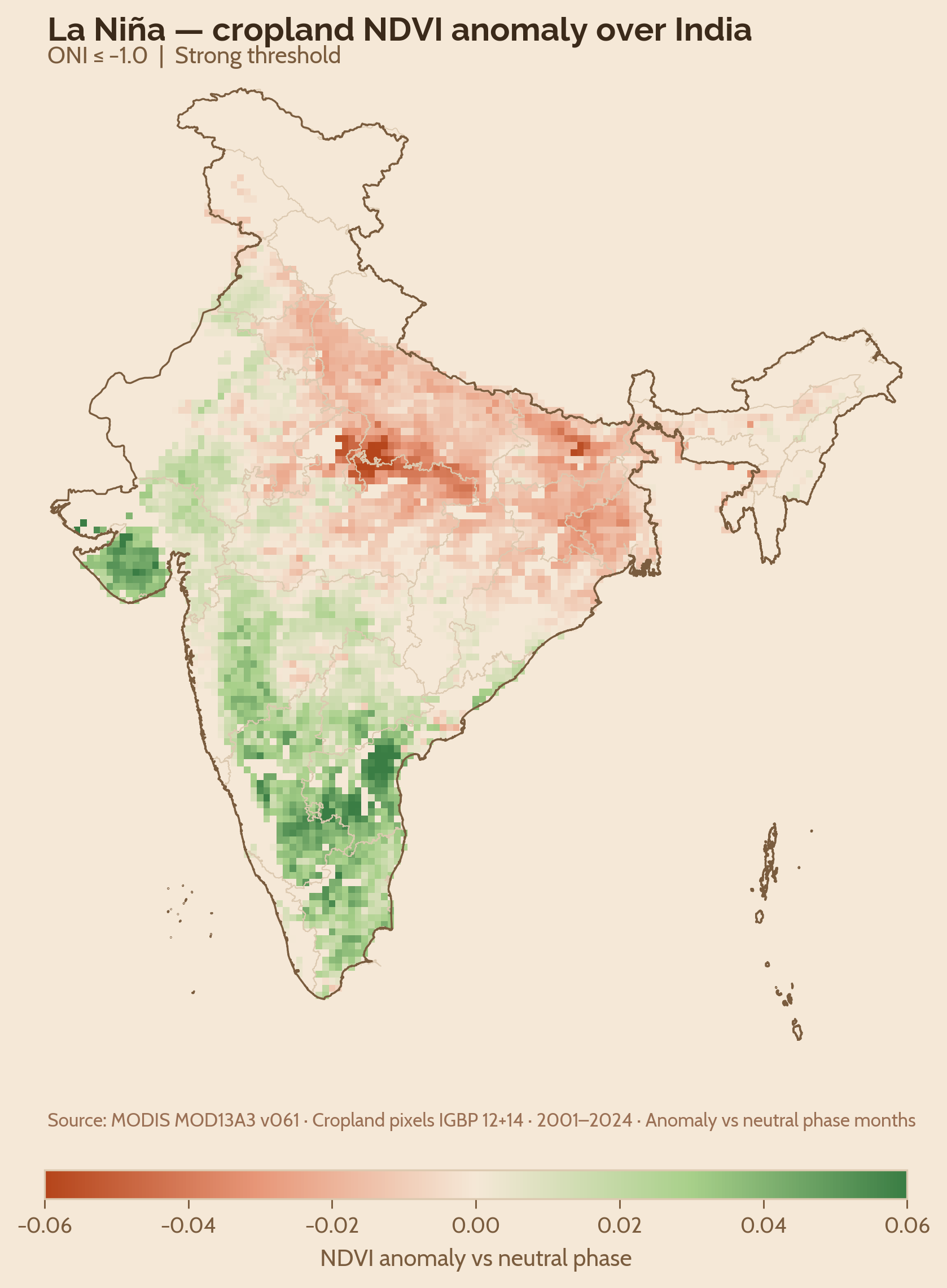
The northwest behaves differently (Figure 8). During Kharif, Punjab, Haryana, and Uttar Pradesh show only weak differences across ENSO phases. This muted response is consistent with an irrigation buffer: vegetation outcomes in the northwest are less tightly tied to monsoon variability than in rainfed peninsular agriculture. During Rabi, however, La Niña years are weaker than neutral and El Niño years, suggesting that ENSO’s effects are not only region-specific but also season-specific.
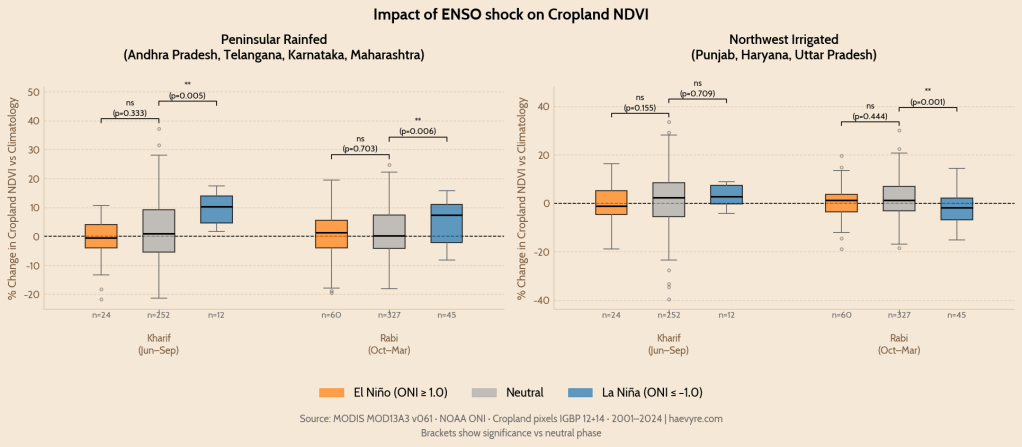
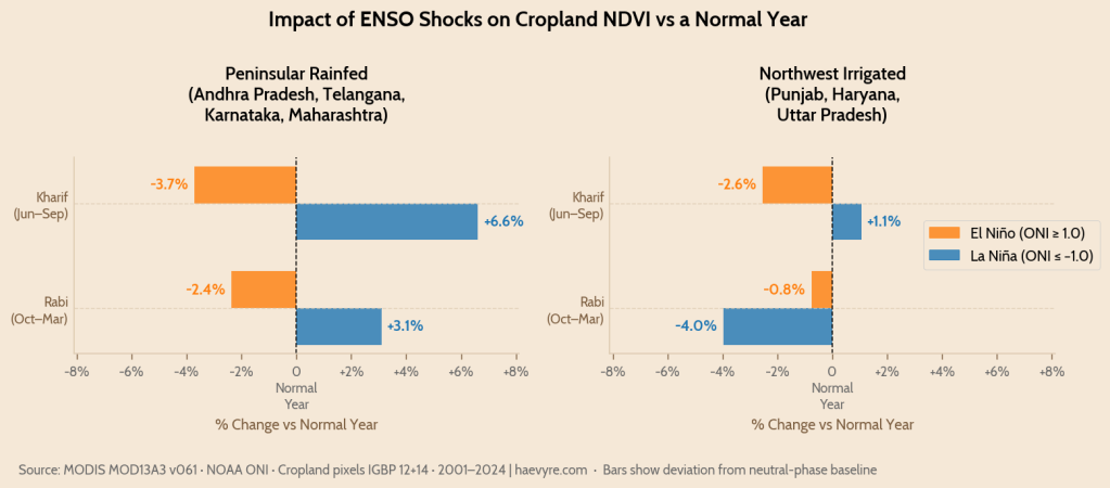
The significance results should therefore be read as a guide to uncertainty, not as a mechanical yes-or-no test. Several El Niño comparisons move in the expected direction but fall short of conventional statistical thresholds, which may reflect the coarseness of state-level aggregation. ENSO impacts are unlikely to follow state boundaries. A district-level or agro-climatic-zone analysis, especially one that separates rainfed from irrigated cropland, may reveal sharper effects. At the scale used here, however, the most robust result is the La Niña vegetation boost in peninsular India and the muted kharif response in the irrigated northwest.
Table 1: Pairwise ENSO phase comparisons of mean cropland NDVI deviation from long-run monthly means, by region and season. Difference = Mean A − Mean B. Sample sizes are unbalanced: neutral months dominate the 2001–2024 record (n range=252–436), while La Niña kharif observations are limited (n range=12–16), which widens uncertainty around those estimates despite statistical significance.
| Region | Season | Comparison | Mean A | Mean B | Difference | p-value | Sig |
| Peninsular | Kharif | El Niño vs Neutral | -1.77% | +1.96% | -3.73 pp | 0.102 | ns |
| Peninsular | Kharif | La Niña vs Neutral | +8.58% | +1.96% | +6.62 pp | 0.002 | ** |
| Peninsular | Kharif | El Niño vs La Niña | -1.77% | +8.58% | -10.35 pp | <0.001 | *** |
| Peninsular | Rabi | El Niño vs Neutral | -0.65% | +1.71% | -2.37 pp | 0.067 | ns |
| Peninsular | Rabi | La Niña vs Neutral | +4.81% | +1.71% | +3.09 pp | 0.004 | ** |
| Peninsular | Rabi | El Niño vs La Niña | -0.65% | +4.81% | -5.46 pp | <0.001 | *** |
| Northwest | Kharif | El Niño vs Neutral | -0.75% | +1.80% | -2.55 pp | 0.155 | ns |
| Northwest | Kharif | La Niña vs Neutral | +2.86% | +1.80% | +1.06 pp | 0.709 | ns |
| Northwest | Kharif | El Niño vs La Niña | -0.75% | +2.86% | -3.61 pp | 0.078 | ns |
| Northwest | Rabi | El Niño vs Neutral | +0.86% | +1.61% | -0.76 pp | 0.444 | ns |
| Northwest | Rabi | La Niña vs Neutral | -2.35% | +1.61% | -3.97 pp | 0.001 | ** |
| Northwest | Rabi | El Niño vs La Niña | +0.86% | -2.35% | +3.21 pp | 0.024 | * |
Together, the NDVI results complicate the simple drought narrative. El Niño leans negative in several comparisons, but the clearest statistical signal in this analysis is La Niña. ENSO does not map cleanly onto Indian agriculture as a single national shock. It is filtered through irrigation, crop calendars, regional rainfall regimes, and the geography of cropping systems. That is why the price signal is so hard to read: while the Pacific may set the rhythm, local agriculture decides how loudly it is heard.
Scene 4: The Buffer and Its Limits
Continuing India’s example, its food system is built around several policies that buffer against global price fluctuations. Some examples include Minimum Support Prices, public procurement through the Food Corporation of India, grain stocks for the Public Distribution System, export controls during price spikes, and urea fertiliser subsidies that absorb most of the input-cost shock. These mechanisms help explain why global food prices do not pass cleanly into Indian food inflation.
During the 2007–08 food crisis, global FFPI inflation averaged 41.5% year-on-year, while India’s food Consumer Price Index (CPI) averaged only 6.4%. In 2010–11, global FFPI inflation averaged 31.7%, while India’s food CPI averaged 7.3%. Thus, while not eliminating global fluctuations, India’s policy provides a significant cushion.
In this dataset, ONI has almost no contemporaneous relationship with India’s food CPI, and the lagged relationship is weak and sensitive to other underlying conditions. But average food inflation is higher during both ENSO extremes, at 7.20% in El Niño months and 7.16% in La Niña months, compared with 5.63% in neutral months. That suggests ENSO does not pass mechanically into Indian food prices but may still coincide with periods of higher domestic food-price stress.
The limits of India’s policy buffer are clearest in three places. First, the buffer is strongest for rice and wheat, where procurement and public stocks are deepest; pulses and oilseeds have support schemes but smaller and more uneven procurement, while vegetables and other perishables sit largely outside the grain-buffer architecture (Hindustan Times, 2025). Second, the impacts are geographically uneven: peninsular rainfed agriculture remains more exposed, while the irrigated northwest is more buffered during kharif. Third, even the northwest has seasonal vulnerabilities, especially in Rabi, where the wheat buffer depends on stable winter and spring conditions.
The stress test came in 2009. El Niño contributed to India’s worst drought in decades, with monsoon rainfall ending around 22% below normal (The Hindu, 2010). India’s food CPI averaged about 10% during the episode and peaked at 14.88% in January 2010. Global food prices, meanwhile, were falling. FFPI dropped from 132.7 in June 2008 to 84.3 in March 2009, a 36.5% decline. In March 2009, FFPI was down 36.3% year-on-year, while India’s food CPI was still rising 7.39%, creating a 43.7 percentage-point divergence.
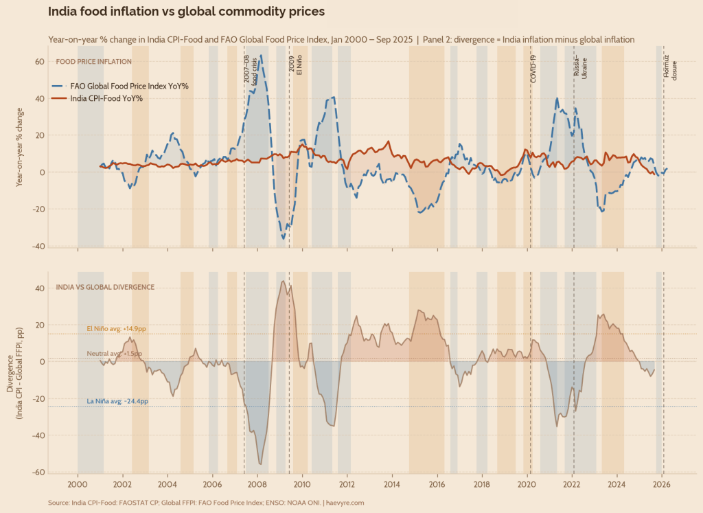
The existing buffers did not prevent a severe domestic inflation shock; however, they still prevented a famine. India was facing a local supply problem while the global market was moving in the opposite direction. This is where the limits of resilience become visible. A food system can be protected from global price transmission and still be vulnerable to domestic climate shocks, regional crop stress, and input-cost disruptions. The question, then, is not whether shocks can be avoided. It is whether the buffer is deep and broad enough when several shocks arrive together.
Scene 5: Resilience as a Buffer
Resilience is not the ability to prevent shocks. Wars, shipping disruptions, heatwaves, and ENSO cycles cannot be controlled by any single country. What can be controlled is the depth and diversity of the buffer when several of them arrive together. Globally, that means investing in agricultural systems that are less dependent on a single fuel source, fertiliser corridor, rainfall pattern, or traded staple. Sustainable agricultural practices such as proper nitrogen and nutrient management, more efficient fertiliser use, soil health restoration, water harvesting, micro-irrigation, diversified cropping systems, and better-targeted food stocks are not separate climate or food-security agendas. They are the same resilience agenda.
India offers a useful example of what this looks like in practice. The West Asian crisis has already exposed its dependence on fuel and fertiliser corridors (Reuters, 2026), while WMO forecasts point to a likely return of El Niño conditions in 2026-27 – potentially strong (World Meteorological Organization, 2026). The lesson from the data is that resilience cannot rest on a single buffer. It has to be built across water, fertiliser, reserves, and trade policy at the same time. Some of this work is already underway, but the data suggests where it needs to deepen.
First, irrigation has to expand beyond the Indo-Gangetic Plain. The NDVI results show that northwest India is partially buffered during kharif, while peninsular rainfed agriculture remains more exposed to climate variability. Closing that gap does not mean replicating cases like Punjab everywhere, where heavy groundwater withdrawals have led to a significant water table decline. It means investing in local water storage, groundwater recharge, micro-irrigation, watershed management, and crop systems that reduce dependence on a single monsoon outcome.
Second, fertiliser security has to be treated as food security. The 2022 and 2026 shocks show how quickly gas, ammonia, urea, phosphate, and potash markets can transmit geopolitical risk into farm costs. India cannot eliminate import dependence, but it can reduce single-corridor exposure by expanding domestic nitrogen capacity, diversifying phosphate and potash suppliers, building strategic fertiliser reserves, and improving and incentivising nutrient-use efficiency so that farmers need less fertiliser to produce the same crop yields.
Third, stock policy has to become more counter-cyclical and more crop-diverse. India already uses grain stocks to cushion shocks, but the buffer is still concentrated around rice and wheat. The next resilience frontier is not just larger but smarter stocks: building reserves when conditions are favourable, releasing them before price spikes become household crises, and extending protection toward pulses, oilseeds, and other crops that drive food inflation but sit outside the strongest procurement channels.
The 2009 episode shows why this matters. The system prevented famine, but it did not prevent inflation. A domestic drought collided with a global market moving for different reasons, and the relief implied by falling world prices did not reach Indian households. So, while India’s buffer didn’t fail completely, we must learn that a buffer designed mainly around grain availability is not enough when the shock travels through climate, fertiliser, energy, and regional crop stress together.
The next agri-food shock will probably not look exactly like 2008, 2009, 2022, or 2026. It may begin with a blocked sea lane, a gas-price spike, a failed monsoon, a heatwave during wheat filling, or a La Niña that shifts rainfall at the wrong moment. More likely, it will be some combination of these. Resilience means building a system that can absorb compound shocks rather than assuming each risk will arrive alone.
That is the anatomy the data reveals: fuel sets the cost floor, fertiliser carries the shock to the farm, climate decides how much the field returns, and policy determines how much of that stress reaches the household. The plate looks local, but the chain behind it is global. The task is not to make that chain shockproof. It is to make sure that when it bends, it does not break.
If you made it this far, please consider subscribing!
References
Dufrénot, G., Ginn, W., & Pourroy, M. (2026). Climate change impacts on commodity price stability through changing ENSO patterns. World Development, 197, 107165. https://doi.org/10.1016/j.worlddev.2025.107165
FAO – FFPI. (2026). FAO FFPI [Dataset]. https://www.fao.org/media/docs/worldfoodsituationlibraries/default-document-library/food_price_indices_data.csv?sfvrsn=523ebd2a_80&download=true
FAOSTAT. (2025a). FAOSTAT – Consumer Price Indices [Dataset]. https://www.fao.org/faostat/en/#data/CP
FAOSTAT. (2025b). FAOSTAT – Crops and livestock products [Dataset]. https://www.fao.org/faostat/en/#data/QCL
FAOSTAT. (2026). Fertilizers by Nutrient (RFN) [Dataset]. https://www.fao.org/faostat/en/#data/RFN
Gouel, C., & Laborde, D. (2021). The crucial role of domestic and international market-mediated adaptation to climate change. Journal of Environmental Economics and Management, 106, 102408. https://doi.org/10.1016/j.jeem.2020.102408
Hindustan Times. (2025, June 2). Procurement of oilseeds and pulses lagging behind cereals. Hindustan Times. https://www.hindustantimes.com/india-news/procurement-of-oilseeds-and-pulses-lagging-behind-cereals-101748803739870.html
IFPRI. (2024, April 5). Global fertilizer trade 2021-2023: What happened after war-related price spikes. IFPRI. https://www.ifpri.org/blog/global-fertilizer-trade-2021-2023-what-happened-after-war-related-price-spikes/
IFPRI. (2026, April 1). The Iran war’s impacts on global fertilizer markets and food production. IFPRI. https://www.ifpri.org/blog/the-iran-wars-impacts-on-global-fertilizer-markets-and-food-production/
NOAA’s Climate Prediction Center. (2026, June). Oceanic Niño Index (ONI): Historical El Niño / La Niña episodes (1950–Present). https://www.cpc.ncep.noaa.gov/products/analysis_monitoring/ensostuff/ONI_v5.php
Reuters. (2026, June 9). India’s fertiliser ministry seeks to double subsidy fund as cost of Iran war mounts. Reuters. https://www.reuters.com/world/india/indias-fertiliser-ministry-seeks-double-subsidy-fund-cost-iran-war-mounts-2026-06-09/
Sarma, N., Tiwari, P., & Rajib, P. (2025). From Fields to Futures: Connectedness Among Edible Oil and Oilseeds- Where Soybean Leads, Others Follow. Asia-Pacific Financial Markets, 32(2), 447–463. https://doi.org/10.1007/s10690-024-09458-7
Sun, T.-T., Wu, T., Chang, H.-L., & Tanasescu, C. (2023). Global agricultural commodity market responses to extreme weather. Economic Research-Ekonomska Istraživanja, 36(3), 2186913. https://doi.org/10.1080/1331677X.2023.2186913
Tang, K., & Xiong, W. (2012). Index Investment and the Financialization of Commodities. Financial Analysts Journal, 68(6), 54–74. https://doi.org/10.2469/faj.v68.n6.5
The Hindu. (2010, May 7). Monsoon mission. Frontline. https://frontline.thehindu.com/the-nation/article30180271.ece
World Bank. (2023, January 5). Fertilizer prices ease but affordability and availability issues linger. World Bank Blogs. https://blogs.worldbank.org/en/opendata/fertilizer-prices-ease-affordability-and-availability-issues-linger
World Bank Pink Sheet. (2026). World Bank Pink Sheet Monthly Commodity Prices (June 2026) [Dataset]. https://thedocs.worldbank.org/en/doc/74e8be41ceb20fa0da750cda2f6b9e4e-0050012026/related/CMO-Historical-Data-Monthly.xlsx
World Meteorological Organization. (2026, June 1). WMO: Prepare for El Niño. World Meteorological Organization. https://wmo.int/news/media-centre/wmo-prepare-el-nino

Leave a comment